Details and Findings
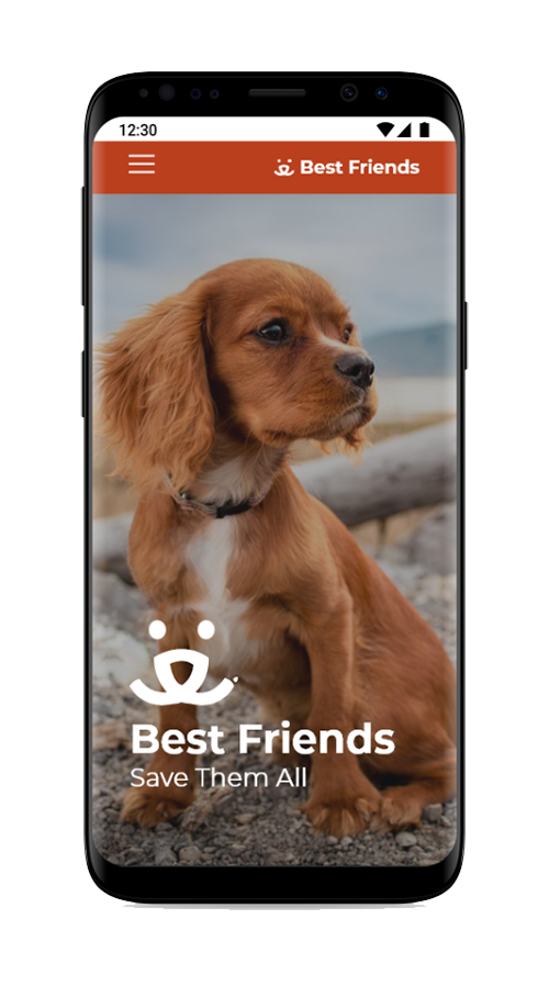
I started this assignment by researching the organization Best Friends of Utah. I read their mission statement and goals. I saw that the organization's main goal is to find homes for animals. In order to do that they rely on donations and support from volunteers. I also looked at their logo, colors, and the types of style they used on their website.
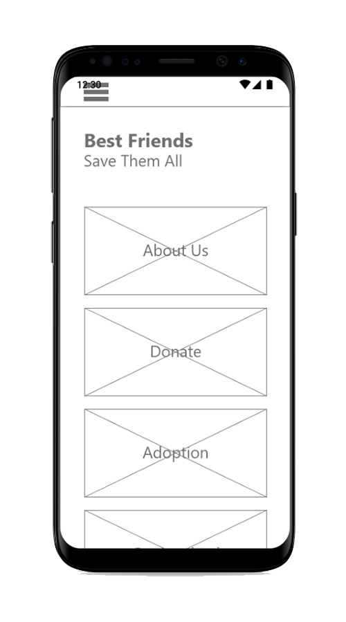
I created 2 user personas. One based around an individual who would be interested in using the app to find a pet to adopt and the other around an individual who would want to support the organization by volunteering. With these users in mind I drew a wireframe using paper and pencil. I then drew out the wireframe in AdobeXD and used that design to create a low fidelity interactive prototype using InVision.
At this point I conducted the first round of user testing. I asked 5 users to complete 5 tasks using the prototype. I asked them for feedback about the layout and the overall design.
I found that most users wanted a banner added on the home page to create more visual interest and to to show new events or information that they would be able to see when they first open the app. I also found out that most of the users did not like the name of the resources page. The most popular alternative was to change the name of the page to articles. They also wanted to add a way to filter through articles. I also found that users wanted a Frequently Asked Questions page which I had not thought to include in the first prototype.
Based on the findings I made adjustments to the design and then created a high fidelity prototype. I added images, color, and made elements to scale in Adobe XD. I imported the high fidelity image files into InVision and created a high fidelity interactive prototype.
Once I had a high fidelity prototype, I asked the same five users for more feedback which I used to make adjustments to the final design. For example, on the adopt page, most of the users agreed that the adopt button was too low on the page and hard to find unless they scrolled to the bottom of the page. I asked each of the users where they would want the button moved. Most suggested putting the buttons under the name of the animal that was being adopted.