Details and Findings
I started this assignment by creating a low fidelity wireframe with paper and pencil. I made a list of the tasks I thought would be necessary for the app and where I would put them in the app. I made a landing page for the app where users would see a list of task lists, a page for making a new list, a list page which would show a list of all the tasks associated with a given list, a screen to create a task, and an example task details page. Using my paper design, I drew up a wireframe in Adobe XD.
Now that I had a starting point, I reached out to 2 potential users and asked for feedback on my design. I created a list of questions for the users. I asked them how they would complete certain tasks using the app and if for feedback on the overall design.
Some Questions that I asked were:
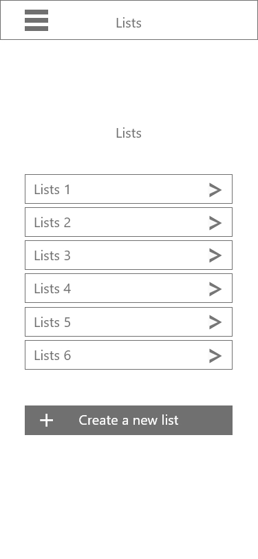
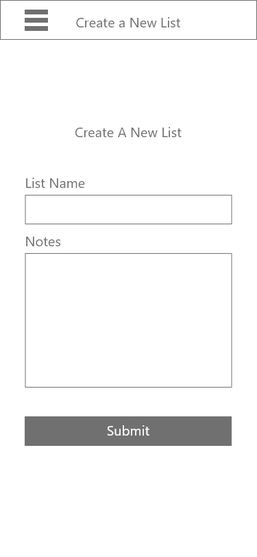
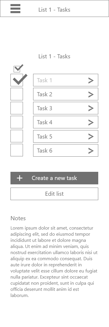
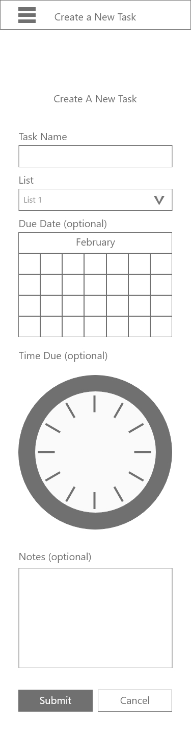
Wireframe created in Adobe XD
Based on the feedback I received from the first user test I decided to redesign the app. I moved the placement of the create a new task button, added a time due field on the create a new task field, and renamed titles. I also added a menu screen, edit list, and edit task pages.
Although it was helpful to get input from users by showing them images of my prototype, I wanted to start testing the functionality of the project. I used invision to model interactions.
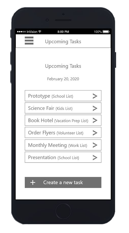
I asked two more users for input on my prototype. I had the users step through some basic tasks like adding, editing, and deleting a list and a task, and I asked them for feedback about the overall design. I learned that users did not like having the lists page be the landing page when they entered the app. They both prefered to see upcoming tasks when they opened the application. There was confusion about how to delete tasks and a lot of concern about accidently deleting a task. Users also said that they did not want to see tasks disappear when they were checked off so they could reference the information later but that they wanted a way to know that they had been completed.There was also confusion about how to enter the time and date on the create a new task field.
Using the information that I learned, I created the next iteration of the prototype. I changed the home screen to be an upcoming tasks page. I added icons to show, edit, and delete and put them next to the name of the item on the top right side of the screen. I added warnings when users clicked on delete. I had tasks lighten and show a check mark if they were checked off but not deleted. I also added calendar and clock icons on the create a new task page. I also added some color to the app so I could emphasize certain elements.

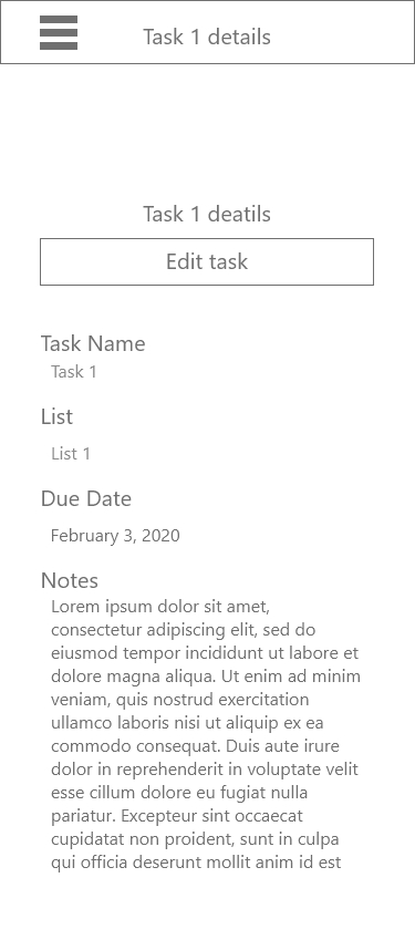
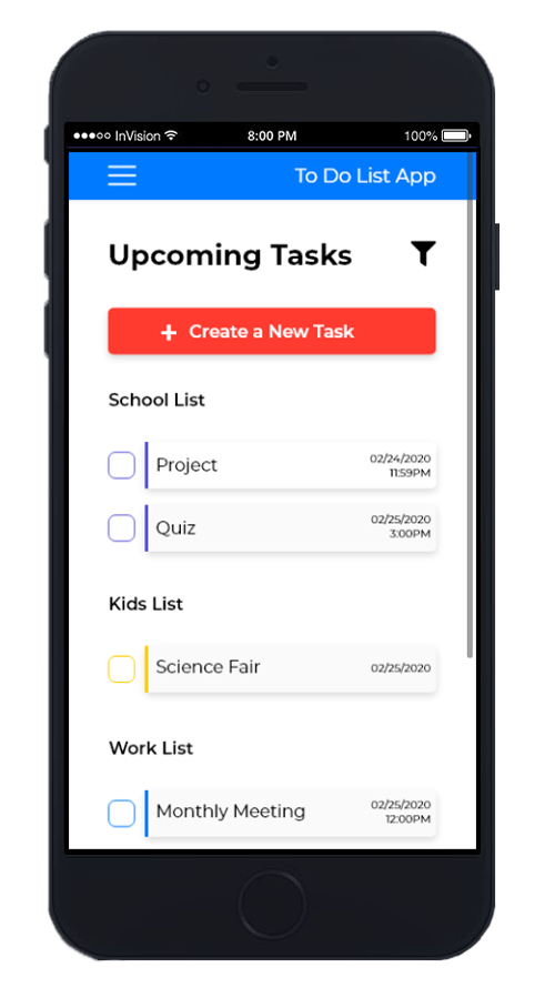
Once I had made those changes, I asked two more users to test the prototype. One of the users that I tested was in her early 60s. She had trouble identifying some of the buttons as buttons because of the light shadow I used. I quickly realized that I needed to change the style of the app. Users suggested adding the name of the app on the right side of the nav bar, shrinking the header section so they could see more of the screen, and adding home by upcoming events in the hamburger menu so it would be easier to find the main screen. When asked, they said they would like the lists page removed and instead have the names of the list added to the hamburger menu so they would be easier to find. They wanted to see a way to customize what events they saw on the. They also wanted the list names on the upcoming events page to be links. They did not like seeing checked off items on the upcoming events screen. They wanted to see the event disappear but they also wanted a warning before it disappeared. One user said he did not like boxes around the information on the task details page because they made those fields look editable and they were not. Users also wanted to be able to set the color of their lists on the create a new list page. At every stage of testing users expressed an interest in color coding tasks.
Based on these findings, I created a new prototype. I also designed the app using 3 different color schemes.

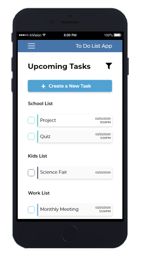
In the next round of testing, I want to see if users like having the lists page in the hamburger menu and the warning for deleting a task. I also want to test the 3 color schemes to see if users prefer brighter colors so they can easily differentiate lists (prototype 4), soft color schemes (prototype 5), or something in between (prototype 3).